Work / Visual Design
backOdyssey
Brand Identity
The Odyssey coffeehouse rejoices in a cozy atmosphere and a unique coffee concept. I embarked on the adventure of creating a new branding concept for this coffee shop.
Personal Project | #graphic design #branding| April 2019
The Brief
While studying, I worked as a Barista for The Odyssey. During this time, I fell in love with coffee even more, if that's possible for someone born in Colombia. I was fascinated by the skills and passion that intervene in making a good cup of coffee. This passion is what customers value when they get their perfect skim-decaf-latte in the morning and, it was passion that sparked my interest in working with the brand of this coffee house.
The Odyssey is located at SAIT's main campus in Calgary; is in the heart of students, faculty, and anyone that has visited. They offer ethically sourced coffee of the best quality and, their expertise for coffee is renowned. On their first decade anniversary, the brand called for a refresh; although they hired an agency to work on that, I wanted to land my inspiration and insight into an alternative design proposal.
The Process
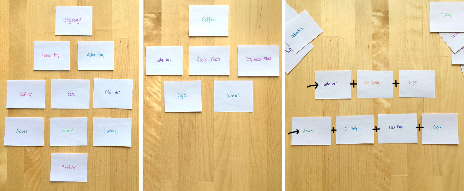
There were some places to start the ideation process. First, the name Odyssey itself brings to memory some images of adventures, old ships, and mythical gods. On the other hand, I wanted to represent the essence of the place: a passion for coffee.
Before jumping into sketching, I started by writing descriptive words, then grouping and connecting them to get ideas that led the sketches into more solid concepts.
Learning about what other coffee brands have done before was a source of inspiration and guided my process. The most recognized brand in the coffee arena, Starbucks, has a captivating history behind its ubiquitous and iconic symbol. Mermaids and mythology are part of the emblem; the simplicity with which they are represented, is a great example of the semantic power of clean lines. Explore the Starbucks logo in detail in the article “what is the starbucks logo”.

The Outcome
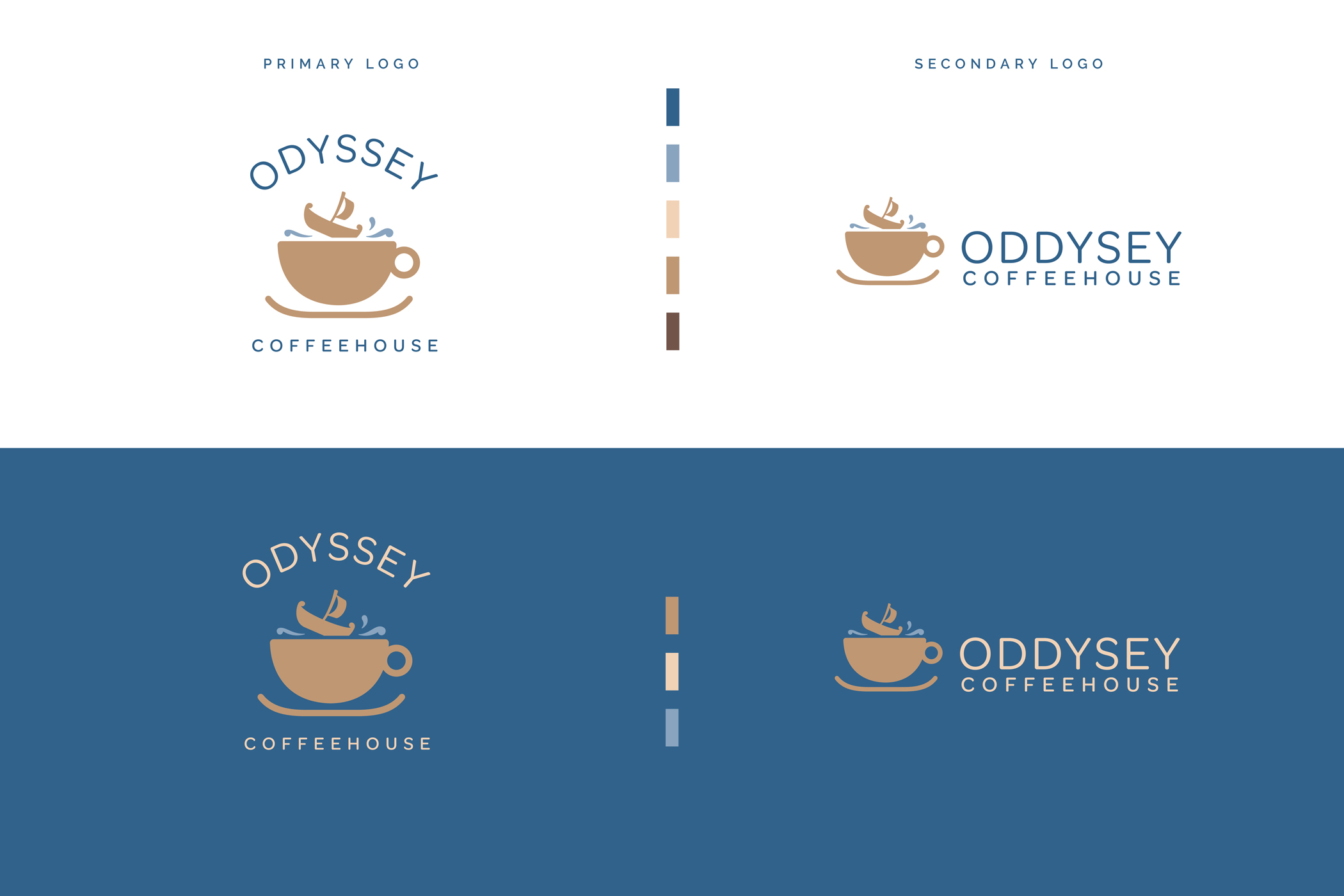
Developing an icon that was representative of coffee and the concept of the Odyssey was somewhat challenging, mainly because of several elements that can take part in the logo. Through numerous iterations, the components with the most semantic weight such as the coffee cup and the galley made the icon. The relationship between the two is the fun idea of a coffee cup as a turbulent sea where the boat is sinking. Once this was defined, a sans serif font completes the logo stacking the icon and brand name in both variations.
