Work / Visual Design
backCampus Illustrated Map
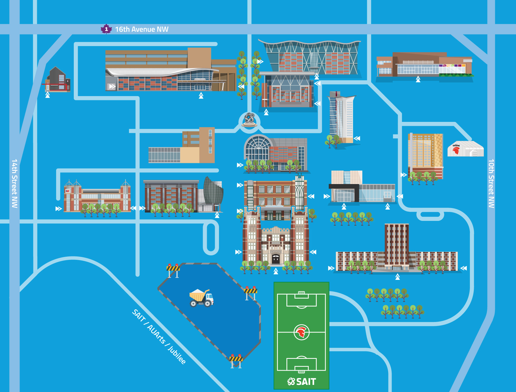
An updated version of the SAIT’s campus map, using illustration to achieve an engaging visual representation.
Project developed for SAIT | #graphic design#illustration | September 2022
The Brief
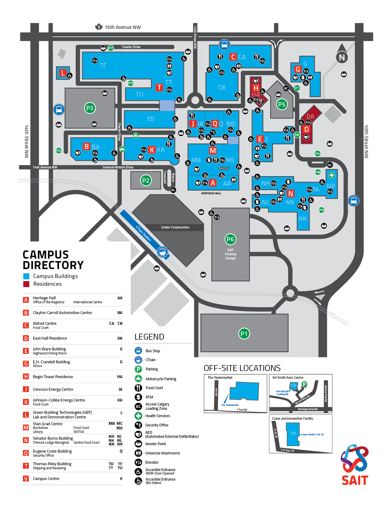
SAIT's previous campus map existed as a static PDF, which had significant limitations for users. It was designed in a traditional format, presenting a sea of icons and text that required users to sift through in search of the information they needed—similar to a "Where's Waldo" experience. This format didn't cater to users looking for specific information, such as building locations or routes to particular campus areas. The primary motivation behind this project was to create an intuitive, interactive map that would allow users to filter locations based on their needs, improving usability and enhancing the overall campus experience. The goal was to craft a solution that made navigation more user-friendly and efficient for both students and visitors.
The Process
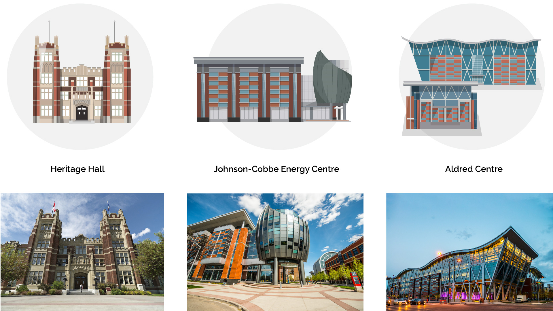
Illustration is one of my favorite aspects of graphic design, particularly when it allows me to reimagine real-world elements in unique ways. For the SAIT campus map, I chose to take a non-traditional approach. Rather than simply tracing building blueprints and adding icons, I wanted to give each building its own identity. I created illustrations that captured the distinct features of each structure, making them recognizable and memorable as landmarks. Instead of showing the buildings from above (which is how we usually see maps), I illustrated them from the front view to create a more engaging and relatable perspective. This approach, combined with clear identification of surrounding roads, ensured that users could easily navigate the campus by recognizing key building features.
The Outcome
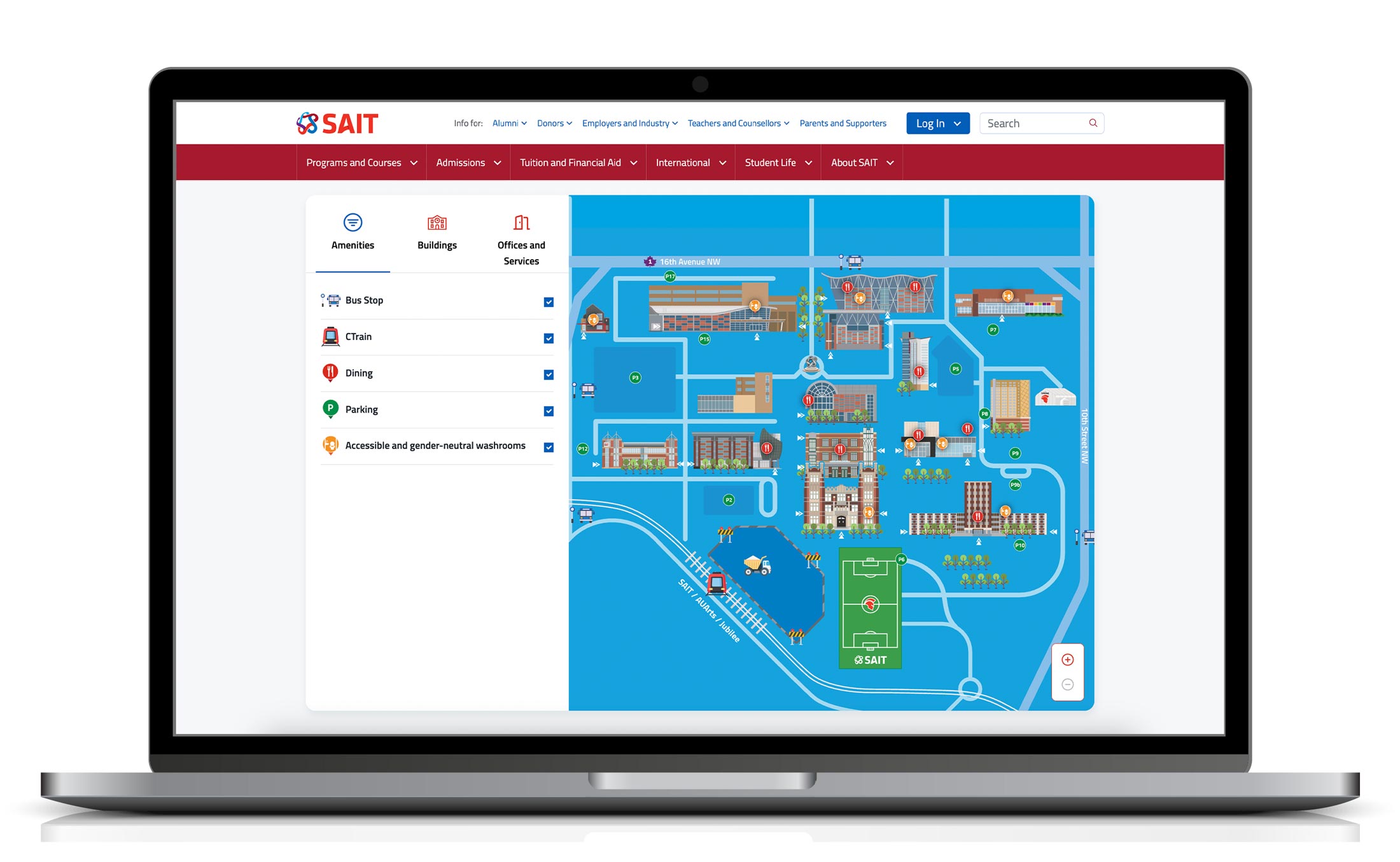
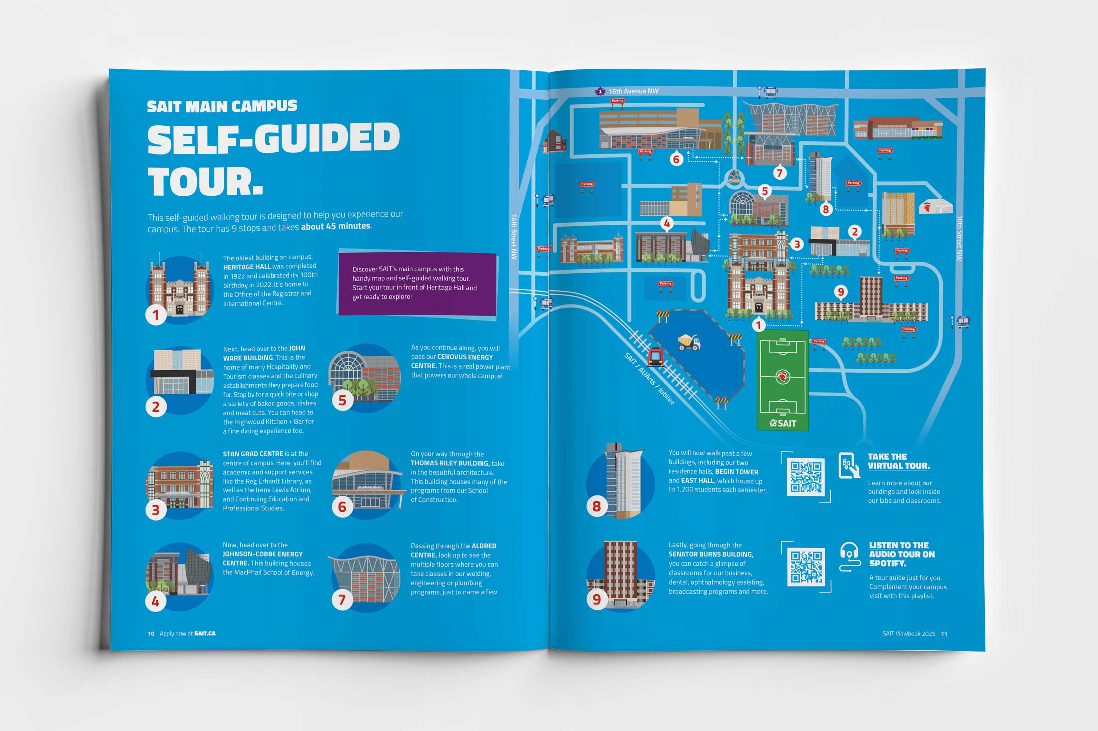
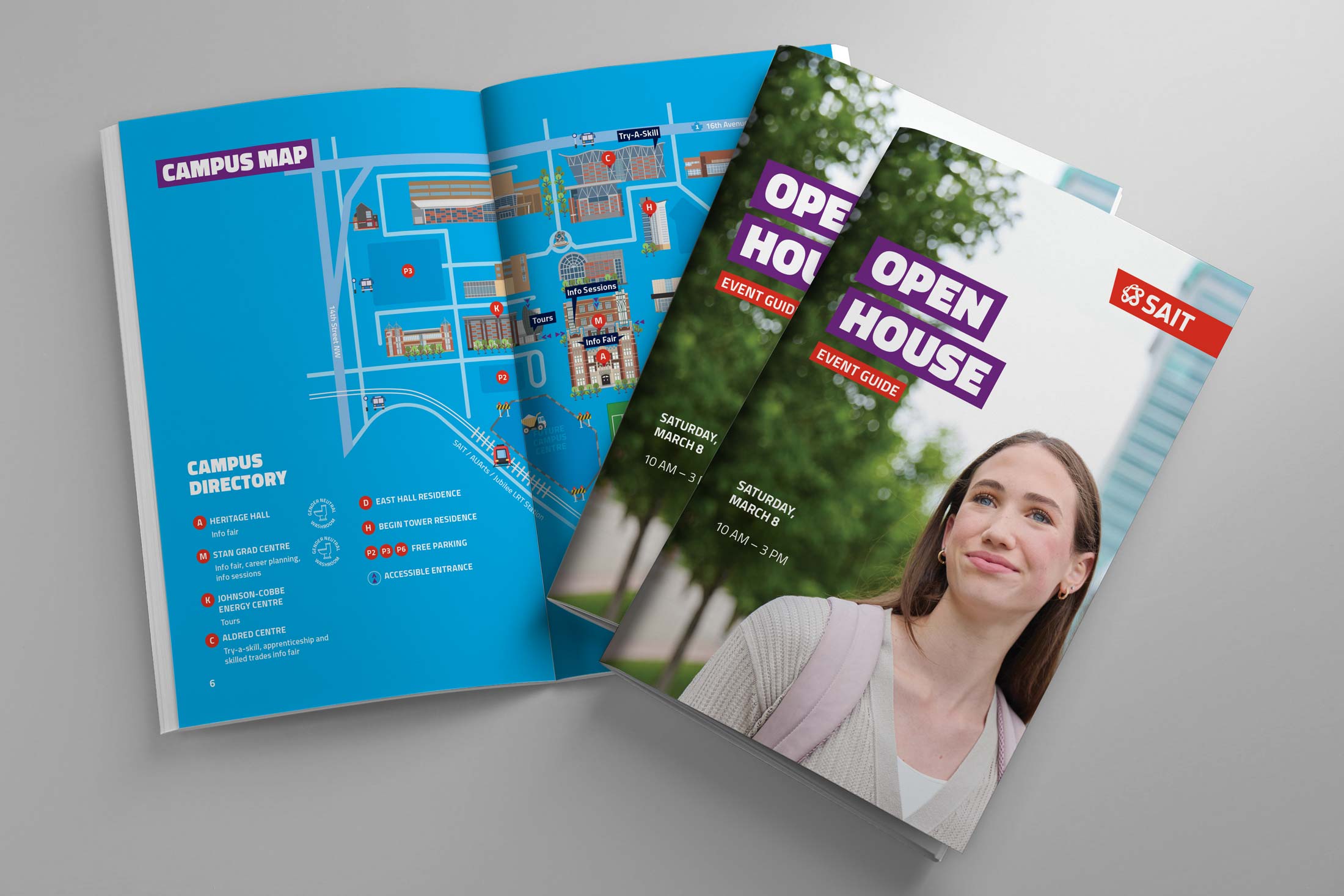
After three weeks of work, the revamped map was completed and first published in SAIT's 2022 viewbook. It quickly became an invaluable tool for visitors, especially during the Open House event, where it guided attendees to various activities. In 2023, the map was adapted into a digital format and replaced the outdated PDF map on SAIT's website. The digital version enhances user experience by offering the ability to filter icons and access a side menu with tabs for amenities, offices, and buildings. Users can tap or click on a building to view more information, which is conveniently displayed in the side bar. Bringing the map to life was a collaborative effort that involved team members from different disciplines. I focused on the illustrations, while web developers and strategists worked together to build the online experience that met the users' needs. Since its launch, the map has seen over 62,334 views (to date, March 2025), proving its effectiveness in helping visitors easily navigate the campus and access relevant details with ease.
